2012 Elements USA review

Despite the fact that it’s my job to criticize games, I really sympathize with developers. Coming up with an original game is hard, and there’s a lot of competition out there, but I really urge developers not to give up and just make uninspired clones of other games, because, as you’re about to see, it rarely ends well.
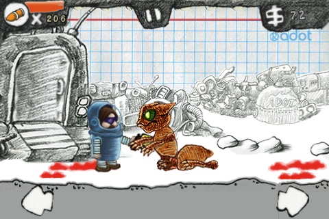
2012 Elements USA is effectively a blatant ripoff of Zombieville USA, right down to the title. You’re a badass astronaut instead of a shotgun toting redneck, and instead of zombies, you’re facing down aliens, but there’s the same side scrolling action and houses you can jump in and out of as you go along. Why are there so many random houses out in space? I really couldn’t tell you.

The game opens with a very long and convoluted backstory having to do with a Mayan prophecy, but the font is almost impossible to read, and as far as I can tell, it has absolutely zero bearing on the rest of the game. All you need to know is that there are aliens, and you want to kill them. The controls are very simple: hold the arrows to move, tap the doors to enter houses, and tap the bottom of the screen to shoot. Unfortunately, the implementation of these minimal controls is surprisingly bad, and it’s very easy to accidentally move instead of shoot or tap the screen continuously as you’re stuck in a house.
You can pick up new weapons along the way, but there is precious little variety amongst the aliens and not a lot of incentive to switch up weapons, since they die pretty easily. And action progresses very slowly, with little to no variation between the levels.
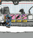
The graphics puzzled me, since I liked the hand drawn nature of the game, but I didn’t understand the motivation behind it, especially since the icon and opening menu make it seem like much different game. Blue-lined graph paper in the background doesn’t scream space to me, even if there’s an astronaut doodled on it. If anything it just makes the game seem hopelessly unfinished. It was clear that on some level, they were aiming for the light-hearted violence of Zombieville, but then shot themselves in the foot by using completely humorless alien designs and moody music, so aesthetically, the game is a mess.
Overall, the game is a big disappointment. Even if I were just looking for Zombieville in space, this would have still been a disappointment, thanks to uneven controls, dull action, and confused art direction. Developers, I know coming up with an original game is hard, but if you just can’t do that, then please, try to at least make the clone worth playing.
AppSafari Rating: /5
Leave Comment
About AppSafari
Popular App Review Categories
- Games
- Featured apps
- iPad apps
- Free apps
- Cydia apps
- App Lists
- Music
- Utilities
- Reference
- Social
- Chat
- Video
- Productivity
- Notes
- Fun
- GPS
- Files
- Augmented reality
- Shopping
- Education
- Finance
- Travel
- Food
- Sports
- News
- Weather
- Health
- Movies
- Photos
- VOIP
- Calendar
- Contacts
- Auto
- Dating
- Books
- Web apps
- All categories >>
Recent iPhone App Reviews
- Elevate – Brain Training May 28th, 14
- UpTo Calendar – Syncs with Google Calendar, iCloud, Outlook and more May 28th, 14
- Quip May 23rd, 14
- Marco Polo: Find Your Phone by Shouting MARCO! May 22nd, 14
- Ku – creative social network May 13th, 14
- Personal Zen May 9th, 14
- Fiasco! Free May 9th, 14
- Forza Football (formerly Live Score Addicts) Apr 29th, 14


