The Daily review

The Daily is an iPad app from News Corp with interactive content updated on a daily basis and optimized exclusively for users of Apple’s tablet device. You can read The Daily for free right now but it will begin costing 99 cents a week, or $39.99 a year starting Feb 19th. There was a whole lot of hype built up leading to the release of The Daily. Its release was even adorned with an Apple announcement. Here’s my review of the app on the iPad.
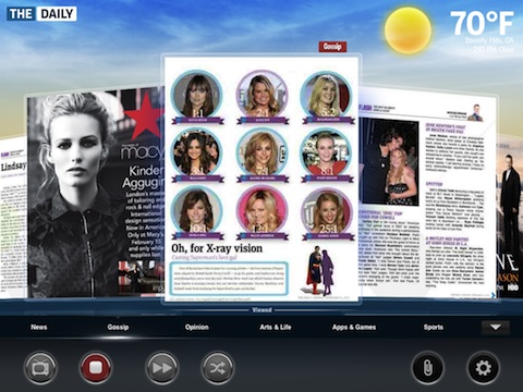
Let me start with the positives. The app is organized into 6 content categories: News, Gossip, Opinion, Arts & Life, Apps & Games, and Sports. The main start page contains a rotating cover flow showing the various content items. This is a good idea, it’s natural for the user not requiring tutorials or instructions. If you just leave the app alone, it will automatically rotate the carousel one item at a time, which is nice if you leave your iPad sitting on a stand. You can manually flick left or right in either direction, although not smoothly (more on this later.) Each page has a red title to let you know which section it belongs to. Another way to navigate is by tapping on the main titles on the horizontal slider which takes you to the first page in that section. On the content pages, a navigation bar on top let’s you know approximately where you are in relation to the entire app. Tap the top black bar to slide down the page thumbnail browser. This shows the pages you’ve already read grayed out and the unread pages are shown with a blue border.

The daily contains original content, created specifically for the app on a daily basis. As with other iPad magazine apps, you have a combination of text, video, images, and other interactive content like social games mashed together. Once you start reading an article you can tap hot spots to watch videos, or zoom in on article photos. The app works in both portrait and landscape modes seamlessly. Some of the content presented is actually varied based on your orientation and you’ll be notified to rotate on those page.
The app has a daily anchor news video update that you can watch. If you like this feature you can make it launch by default on start-up. Otherwise hit the “up arrow” on the bottom of the page to reveal a hidden menu. Tap the TV icon to watch the video update. There are 3 other buttons besides the TV icon here as well. There is no documentation provided in the app to explain what these hidden buttons do, so let me explain.
– The headphone button will narrate some articles out-loud to you. The audio content is not just text-to-speech, but is recorded by a professional reader for this app. This feature is actually quite amazing, and probably the one thing that has impressed me so far about The Daily.
– The Auto-play button flips the Carousel story-by-story until you tap it again.
– The Shuffle button jumps to random pages repeatedly until you tap it again.

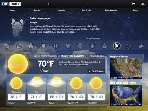
A personalizable section of the app lets you see weather forecasts, daily horoscopes and sports updates for your teams. You can play social Sudoku and Crossword puzzles in the games section, and your scores are synced via Game Center.
Since new content is swapped out daily, you can choose to save pages to be read in the future. Each page also lets you post comments. Another neat feature in the Daily is the ability to post voice comments and listen to other people’s voice recordings as reactions to various content pages. It would be nice to see all the voice comments in one place instead of having to go hunt for them one at a time per page. You do have to sign up for an account to post comments.
Now for The problems with The Daily:

The first time you load The Daily every morning, you are greeted with a loading… page. This part of the app is absolutely frustrating and drives me crazy. It takes about a minute to download the day’s updates, so normally I open the app and walk away for a coffee. This “updating” happens again on repeat opening of the app, even though we are told it should be only once a day. Why do we have to wait? In the age of RSS feeds and Twitter updates, waiting for an app to “download” content updates is absolutely ridiculous. Do your work in the background if you have to but don’t make the user wait! Now, even if you are absolutely dead set on making the user wait… why don’t you let us view the existing content while you “download” the updates? As it is, you are basically punished each morning for opening the app, instead of rewarded. Doesn’t really make for a happy experience, and you can’t expect people to actually pay for that type of experience.

The other big issue is the performance of the app. First of all it crashes randomly on load. Yes the app crashes. Not very cool, and a sign of memory leak issues that need to be addressed. The iPad is really a powerful computing device. Some very amazing games with high quality graphics and process intensive engines have been released that run extremely smoothly on the iPad. Which is why it doesn’t make sense why a basic carousel can’t run smoothly on the iPad. Flipping through the pages on the carousel is not smooth to say the least. Dare I say it doesn’t even feel like an Apple touchscreen. The action response is so badly delayed and fidgety that it feels like you’re using an Android device. Fix this issue, this is deal breaker number two.
Just how awful is The Daily’s navigation and performance? Bad enough to motivate developer Loren Brichter to spend the evening coming up with how he would improve the annoying carousel. Loren is best known for his work on the Official Twitter app.
The jumpy navigation issues continue to the full article pages as well. When you flip from one page to the next, many times you’ll have to wait for the content to appear. Whether it is being rendered or being download, it is not a good user experience. This stuff should be preloaded.
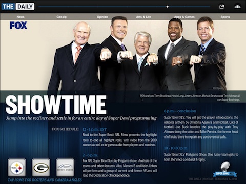
There is no simple way to view a basic table of contents for the articles in the issue. The carousel and the thumbnails are as close as you get to such an index but those pieces are tediously slow to navigate through. There aren’t any back/forward buttons like people are used to in a web browser. For a much cleaner way to navigate content take a look at the Zinio iPad app or the Super Bowl XLV iPad app.
While having weather and sports information is nice, there is no finance section for tracking your investments or seeing market updates. Also there is no way to tell the app to at least open to your Sports page or your Weather page by default.
The app has ads. Not a big deal to me, but for a subscription based news product others might disagree.
No support for background iPod music. This is not a big deal breaker, but would be a nice to have.
Overall, I can not recommend this app at all at this point. The content is original, although nothing radically impressive you can’t live without. The price at 99 cents per week is actually very reasonable. The app itself however is extremely difficult to navigate through and sluggish content updates stymie the user’s productivity. Let’s hope future updates will address some of these issues.
Here is a video demo of the The Daily app on the iPhone
AppSafari Rating: /5
Leave Comment
About AppSafari
Popular App Review Categories
- Games
- Featured apps
- iPad apps
- Free apps
- Cydia apps
- App Lists
- Music
- Utilities
- Reference
- Social
- Chat
- Video
- Productivity
- Notes
- Fun
- GPS
- Files
- Augmented reality
- Shopping
- Education
- Finance
- Travel
- Food
- Sports
- News
- Weather
- Health
- Movies
- Photos
- VOIP
- Calendar
- Contacts
- Auto
- Dating
- Books
- Web apps
- All categories >>
Recent iPhone App Reviews
- Elevate – Brain Training May 28th, 14
- UpTo Calendar – Syncs with Google Calendar, iCloud, Outlook and more May 28th, 14
- Quip May 23rd, 14
- Marco Polo: Find Your Phone by Shouting MARCO! May 22nd, 14
- Ku – creative social network May 13th, 14
- Personal Zen May 9th, 14
- Fiasco! Free May 9th, 14
- Forza Football (formerly Live Score Addicts) Apr 29th, 14


