Paper – stories from Facebook review

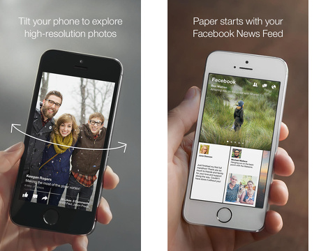
The Paper iPhone app makes Facebook fresh and interesting again. The updated interface creates a new perspective of your current Facebook news feed, while exposing you to curated, engaging content. The Paper -stories from Facebook iPhone app blends some of the more successful elements of the Huffington Post, Buzzfeed, and Pinterest iOS apps.
It opens with an unusual video tutorial and TomTom-style voice prompts. It is informative and useful, but I haven’t decided how much I really like it. I am still on the fence with my phone talking to me, so perhaps my ambivalence is not necessarily shared by others. The video introduction is a reminder that Paper is intended to be a throwback to old school postcards, letters, and newspapers. There is nothing vintage about Paper, when, interestingly enough, it is actually a more sophisticated, forward-leaning social networking interface than the Facebook iOS app.

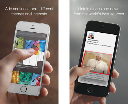
In the introduction, you create multiple feeds. Your Facebook news feed is your first feed. Then, you tap and drag new categories of content up to add them. Like Huffington Post, you have access to a feed dedicated to specific categories including news, technology, pop culture, design, food, art, travel, and more. There are LOL and cute, so BuzzFeed lovers will have it all at their fingertips.
The feeds have a cleaner, crisper interface. All of the normal tools are available as icons – friends, message, notifications, photos, tag, and location – but, the graphic design allows them to recede and soften. The graphic enhancements are subtle improvements. When you update your status or share from Paper, you do it on a full screen – not a pop-up like Facebook. At the top of each feed, there is a larger photo with the person or content provider and status. In the lower portion of the screen, the items shared are housed in smaller rectangles.

The gesture controls provide a seamless experience. When you swipe left and right on the larger image at the top, you move between the different feeds. When you swipe horizontally on the smaller rectangles, you move among posts in the same category. A tap on an item pops it from the feed, and it fills the screen. You can tap an article, and it expands for you to read it in its entirety. If you tap a URL shared in a status, the URL expands for you to check out that content. The content is shared with you in increments like Pinterest, but the interface feels more delicate and intuitive.
Paper does not do something I would love for it to do. When you like or follow news organizations, they should appear in the Headlines feed. There are certain duplications in content that seem unnecessary. Also, it would de-clutter your Facebook news feed and would make much more sense. I believe the algorithm is within reach to tidy up our Facebook news feeds and plug in items where they make sense.
The Paper iPhone app is worth a shot to make you fall back in love with Facebook. Or, at least, if you make more selections about your preferences, their advertisements may become more effective and you won’t have to spout off about them to your Facebook friends.
AppSafari Rating: /5
Leave Comment
About AppSafari
Popular App Review Categories
- Games
- Featured apps
- iPad apps
- Free apps
- Cydia apps
- App Lists
- Music
- Utilities
- Reference
- Social
- Chat
- Video
- Productivity
- Notes
- Fun
- GPS
- Files
- Augmented reality
- Shopping
- Education
- Finance
- Travel
- Food
- Sports
- News
- Weather
- Health
- Movies
- Photos
- VOIP
- Calendar
- Contacts
- Auto
- Dating
- Books
- Web apps
- All categories >>
Recent iPhone App Reviews
- Elevate – Brain Training May 28th, 14
- UpTo Calendar – Syncs with Google Calendar, iCloud, Outlook and more May 28th, 14
- Quip May 23rd, 14
- Marco Polo: Find Your Phone by Shouting MARCO! May 22nd, 14
- Ku – creative social network May 13th, 14
- Personal Zen May 9th, 14
- Fiasco! Free May 9th, 14
- Forza Football (formerly Live Score Addicts) Apr 29th, 14


