CircleMe review

Do you turn to the Facebook, Twitter, Yelp, and Pinterest apps to share details about every great meal, cool store, exciting vacation, and awesome new movie in your life? The CircleMe iPhone app combines the functionality of all of those social networks, but adds the exciting twist of giving recommendations, a soundtrack, a note of encouragement, or any angle you can imagine via virtual reminders using CircleMe and Location Services. Does your boyfriend have an important meeting at work? You can send him an inspiring song and quick note through CircleMe, as he walks into the door of his office. Do you think everyone who visits a great new restaurant should try a certain dish? You can set up a recommendation for everyone who uses CircleMe to order it. It’s an interesting concept to merge your online life with your offline life, and CircleMe has developed an interesting first start. With some finesse and enhanced iPhone app interface, CircleMe has potential to be a great, progressive social networking experience.

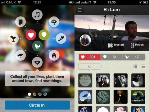
The CircleMe iPhone app interface takes its cues straight from Facebook with one big exception. You access your navigation menu from a sliding pop-out on the left side of the screen. You even have the option of uploading a profile photo and cover photo. Your profile page contains your photo, your cover, and a synopsis of your likes, to do list items, and suggestions. The big exception is a lack of strong content. Visually, it’s sparse, and there are no pop-ups to guide you and create engagement. Some pop-ups to help you get started would be excellent additions to the CircleMe iPhone app. Also, CircleMe should consider classic Pinterest and Twitter moves by asking new users to pick a few topics of interest. Social networking lives and thrives on content and engagement, and CircleMe just doesn’t make that happen fast enough in the iPhone app.

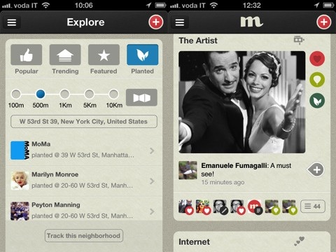
The CircleMe iPhone app home screen is blank. You add “plants,” to do items, and likes by pressing the plus icon in the top right corner. The three icons help you create your profile. The “plants” icon is the way you create virtual recommendations and experiences. The default “plant” is the ability to add a special song from your iTunes library at a specific location. You can choose to make your “plant” private or public. You can add some text to explain why you think this song is a great idea. You press the balloon icon to add an item to your to do list. You type your item, and a list of selections fills the screen. You may select one from the thorough CircleMe list, or you may create your own with quick, easy steps. You can also add likes and include comments, if you choose.
There was still always something missing for me with the CircleMe iPhone app, so I checked out CircleMe.com online. CircleMe’s online presence is much more interesting and engaging than the iPhone app. Visually, there was much more to explore. Like Pinterest, the images linked to blogs, websites, musicians, and more. Users shared what they love, what they hoped for, and how their lives were impacted by a CircleMe post. Unfortunately, the CircleMe iPhone app interface doesn’t reflect that same experience despite this super cool functionality of the “plants.” I root for CircleMe to cultivate its iPhone app interface because this seedling has room to grow.
AppSafari Rating: /5
Leave Comment
About AppSafari
Popular App Review Categories
- Games
- Featured apps
- iPad apps
- Free apps
- Cydia apps
- App Lists
- Music
- Utilities
- Reference
- Social
- Chat
- Video
- Productivity
- Notes
- Fun
- GPS
- Files
- Augmented reality
- Shopping
- Education
- Finance
- Travel
- Food
- Sports
- News
- Weather
- Health
- Movies
- Photos
- VOIP
- Calendar
- Contacts
- Auto
- Dating
- Books
- Web apps
- All categories >>
Recent iPhone App Reviews
- Elevate – Brain Training May 28th, 14
- UpTo Calendar – Syncs with Google Calendar, iCloud, Outlook and more May 28th, 14
- Quip May 23rd, 14
- Marco Polo: Find Your Phone by Shouting MARCO! May 22nd, 14
- Ku – creative social network May 13th, 14
- Personal Zen May 9th, 14
- Fiasco! Free May 9th, 14
- Forza Football (formerly Live Score Addicts) Apr 29th, 14


