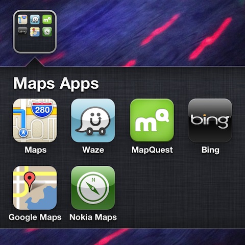
Tim Cook offered his apologies today for the disappointing performance of the new Apple Maps app in iOS 6. In this letter, he mentioned five alternatives to use until Apple has improved its app. He recommended using the Bing, Waze, and MapQuest iPhone apps from the App Store, as well as a couple of web based app alternatives from Google and Nokia. At AppSafari.com, we checked out each of the iPhone apps and web apps to help you determine which maps app can best help you.

The Bing iPhone app requires an authorization to access location services. You are transported to a screen where you must select maps to access the appropriate interface. The Bing iPhone app has a simple field at the top of the screen to enter a new location. By using its search capabilities, you can type in an address or name of a location. I typed in my favorite restaurant to get french fries. The telephone number and address popped on the screen, and the new location was noted with a large dot. With one touch, I could obtain directions. You can also select the mode of transportation you prefer–car, public transit, and walking. The map fills the top half of the screen, and nicely-sized step-by-step directions fill the bottom. As you scroll to the next step, the map adjusts to show the turn. The public transit directions are efficiently presented as well. You are directed to walk, take a train, or bus. It also incorporates the next available times, and the greatest feature is the proverbial, “If you get here, you’ve gone too far.” You can share your directions to your friends on Facebook and establish a route as a bookmark with simple one-touch functionality. The Bing iPhone app is an excellent selection for all users, but is particularly helpful for those who rely on public transportation.
Waze is a crowd-sourced traffic app available for iPhone and iPad. To access Waze’s full functionality, you will want to establish an account. You can select to be pinged or not with one touch, as well as sync with Facebook and Twitter. You can use pinches and swipes to see your route and any traffic problems you may encounter. The crowd-sourced information is grouped in the conversation bubble. In an interface similar to the new photo-sharing features in iOS 6, a matrix grid of six options pops up to help you navigate, meet up, check out your account, view traffic reports, change settings, and turn off Waze. The navigate feature is a great tool for commuters. You can establish your favorite routes, so you can check the traffic report prior to hitting the road. The reports icon is extremely helpful, as it categorizes the reports in a list. You can scroll through all of the reports, police reports, traffic jams, accidents, chit chats, and other problems. For each selection, you can sort in one touch to find those around you, on your route, or in your groups. The groups feature is an interesting item, as you can connect with people who share the same commute to develop a social relationship. The crowd-sourcing icon is a matrix of nine selections as well. When you touch the icon, your location and the time is noted. You can then report a traffic jam, police, accident, hazard, camera, chit chat, report gas prices, and check in. The Waze iPhone and iPad app is best-suited for those who travel by car. If you love crowd-sourcing and social networking, then the chance to report your mood and chat with others en route will keep you entertained.
The MapQuest app is a waste of precious memory space in your iPhone. The top menu bar gives you an opportunity to enter an address or location name, but an ad bar pops-up intermittently just below it. So, you have to be careful that you don’t accidentally tap the ad banner. Across the bottom of the screen are selections for hotels, restaurants, gas, airports, coffee, bars, shopping, post offices, parking, grocery stores, schools, hospitals, and pharmacies. With a touch on the icon, hopefully selections are identified on the screen. Unfortunately, if the area of your map does not have a type of location. It simply says none available, and you have to zoom your map. Then, a menu button and a list button pop onto the screen. The list then expands with an advertisement at the top of the screen. The graphics are cloudy and dull, and you have to do a lot of work to get relevant information and directions. Perhaps, Tim Cook should not have recommended MapQuest, as the iOS 6 maps app is far superior to it.
The Google Maps Web App functions with the assistance of icons and fields in a bar at the top of the screen. You can simply enter the location to search, and, as you bookmark locations, you are transported to the location with a touch. If you want step by step directions, you simply press the arrow icon. The step-by-step directions are entered simply into the A & B fields. You can add additional destinations, as well as select the mode of transportation from car, public, walking, and biking. The directions are step-by-step with an icon to note a right or left turn. The step-by-step directions are not as large as Bing’s iPhone app, so you can’t quickly glance at them. You can also switch to a map view with one touch on the location icon at the top part of the screen. The transit directions with the Google Maps Web App have a nice feature to select a time of travel. You can choose to leave now, a specific departure time, or an arrival time. The transit directions use appropriate icons and give you detailed stop information, time, and distance. The Google Maps Web App has familiar functionality and tools, but you will be at the mercy of your 3G or 4G connection for best performance.
The Nokia Maps Web App has a top menu bar for navigation. You can create favorite routes, as well as save a map area for an easy chance to revisit an area by touching the dot icon. The list icon is an unfiltered list of nearby locations. There is no opportunity to sort the locations, so the list icon is fairly useless. If you want to get directions, you must press the dot icon, then the route icon. You can use your location services to establish the beginning point, and then enter a destination. Three modes of transit and a route pop on the screen. When you touch walk, car, or public, the route may change. The default view is a map showing the broad picture of the route. You touch the list icon to change the screen view to step-by-step directions. The directions are concise and easily understood–basically just like the Google Maps Web App’s written directions. The Nokia Maps Web App is accurate and simple, but the grainy and uninspired graphics make an evening out and about a bit depressing.


 Bing
Bing Waze social GPS traffic & gas
 MapQuest
 Google Maps (website)
 Nokia Maps (website)
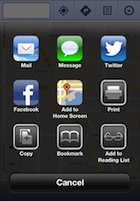
 The Bing iPhone app, Waze iPhone and iPad App, and Google Maps Web App are the top performing of the five choices recommended by Tim Cook. You can add the web apps to your iPhone homescreen by pressing the share icon in Safari, touching “Add to Home Screen, and a final touch to authorize the action. If you use public transit, then Bing and Google Maps are certainly the way to go. If you are a road warrior, then Waze could definitely save you time and a case of road rage.