Agenda – A Better Calendar with Today’s Date review

Do you feel annoyed in small spaces? Now you don’t have to. Agenda is a replacement app for the iPhone or iPod touch developed by App Savvy which sells for $1.99 in the App Store. If you’re a regular user of the default Calendar app on the iPhone, you’ll be amazed at how much more useful, and yes in fact “better” Agenda is at giving you the information you need about your appointments. Agenda uses a plain white background layout and utilizes simple swipe gestures to get you from and to the places you need instantly. You also get contextual information in the various set of screens without all the unnecessary junk. Agenda is simple, logical, usable, and most importantly a joy to use. Agenda goes to show that you can in fact do a lot with the small iPhone screen, if you think differently.
Minimal design enthusiasts are going to automatically love the Agenda app. Now although its design is scaled and stripped down purposefully, the functionality in Agenda is actually the same as you get in Calendar. The only missing piece is that you will get today’s date in the form of a badge prompt over the icon instead of the native number the Calendar app has over its icon. I’m not sure why only Apple gets to do the native icon mods and 3rd party developers are stuck with the badge, but I for one don’t like seeing that badge, so I’ve turned that feature off in Agenda. Note that unlike what the app’s icon shows in the App Store, the red date circle sticks out of the app’s icon like any other notification message badge on the iPhone. Nevertheless I’m still sold on this app and have replaced it on my Home Screen. Calendar now sits in a utility folder deep inside the 3rd page on my iPhone.

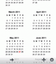
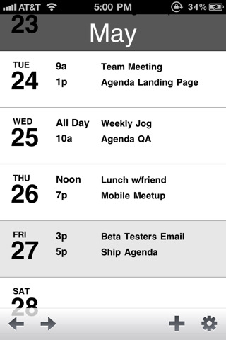
When you open Agenda, you get the scrolling month view which lists the days of the month along with your appointments for each day neatly. Swiping is where Agenda lives. Swipe left from here to see the full month view, with simple 1-31 numbering and color coded dots for your events. Each day is active so you can tap it to jump to it. Swipe left again to go to the year view, where you can see 6 months at a time and can scroll up or down to see the other 6 months of the year.
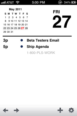
Now swiping right from the month list view, gets you to Today’s calendar. You get a nice month snapshot on the top left, today’s date on the top right, and your events all listed underneath in a large legible white page. No more being stuck scrolling in that tiny little iframe looking window in the Calendar app. Swipe right again and you get a blow up look at individual events, and by default the app is smart enough to take you to your next upcoming event. This sort of pre-thinking smarts are also what makes Agenda so useful.
In most of the screens you can also swipe up or down and the app takes you to the previous or next set of events, days, months, or years.
In all the screen yo can tap the + button to create a new event. This screen is pretty much identical to what the Calendar app gives you. There are left and right buttons on the bottom as well if you’re not easy with swiping. Finally a setting button exists which takes you to the options page. You can choose which of your iPhone calendars you want to view, and either enable or disable the badge icon date.

Now for some ideas for improvements. Please make the navigation bar icons disappear when the user is not touching the screen. The app is so clean and fresh, but those icons are a bit annoying to see all the time. Give us the option of using a white on black theme. As much as I love the white look, also maybe having a simple color chooser would be a nice theming addition. Finally, as much as I love this app, its icon could be a lot prettier. Especially since it now sits on the top right of my Home Screen, I wish it was a bit more snazzy. Finally, please, make an iPad version of Agenda, if it isn’t already in the works that is.
Overall, I would recommend the Agenda app to anyone who wants to be more productive on their iPhone. Spend the $2 and get yourself Agenda. You’ll be happy you did. Now I just hope that someone at Apple is looking at Agenda and thinking about how they can bring some of the ideas into their native Calendar app.
Here is a video demo of the Agenda – A Better Calendar with Today’s Date app on the iPhone
AppSafari Rating: /5
Leave Comment
About AppSafari
Popular App Review Categories
- Games
- Featured apps
- iPad apps
- Free apps
- Cydia apps
- App Lists
- Music
- Utilities
- Reference
- Social
- Chat
- Video
- Productivity
- Notes
- Fun
- GPS
- Files
- Augmented reality
- Shopping
- Education
- Finance
- Travel
- Food
- Sports
- News
- Weather
- Health
- Movies
- Photos
- VOIP
- Calendar
- Contacts
- Auto
- Dating
- Books
- Web apps
- All categories >>
Recent iPhone App Reviews
- Elevate – Brain Training May 28th, 14
- UpTo Calendar – Syncs with Google Calendar, iCloud, Outlook and more May 28th, 14
- Quip May 23rd, 14
- Marco Polo: Find Your Phone by Shouting MARCO! May 22nd, 14
- Ku – creative social network May 13th, 14
- Personal Zen May 9th, 14
- Fiasco! Free May 9th, 14
- Forza Football (formerly Live Score Addicts) Apr 29th, 14


