Ban.jo review

Do you love to catch up with friends in your existing social networks in person, or do you like to get the latest scoop about restaurants and events in a city you plan to visit? The Ban.jo iPhone app attempts to integrate your existing social networks and add public posts in social networks to keep you in the loop about life in your favorite locations. The Ban.jo iPhone app, unfortunately, has several interface and navigation issues to address, in order to make it simple and intuitive to connect information cohesively.
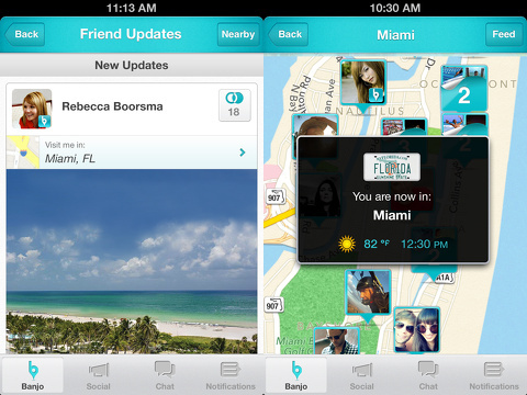
The functionality of the Ban.jo iPhone app relies on syncing your existing social networking accounts, including Twitter, Facebook, Foursquare, LinkedIn, and Instagram. You can select from all but LinkedIn to get started. After the first sync, you are transported to the home screen. In the menu bar at the top of the screen, your photo in the right hand corner is the icon you touch to access your profile. At the bottom of the screen, there is a navigation bar, so you can move with one touch between Banjo’s home screen, social, chat, and notifications. The home screen has an area to find your friends, search for a specific location, and highlighted locations with a matrix of photos and name of city. Unfortunately, this structure doesn’t provide a strong enough foundation to keep the tools and features organized.

The social icon at the bottom of the screen is a redundant feature, as you can sync your networks by touching your profile. One additional quirk is the selection of networks available to sync. When you open the Ban.jo iPhone app, you can connect with Twitter, Facebook, Foursquare, and Instagram. However, when you touch the social icon and your profile, LinkedIn pops up as an option. There is also an option to suggest a social network by sending a note to the developers. When an iOS app relies on syncs with other social networks, the interface can get muddy and confusing. Some simple editing to make sure you are consistent is crucial when you are trying to link so many networks, tools, and functionalities. Redundant tools and functions clutter crucial real estate in an iPhone app’s screen.
Ban.jo didn’t just miss the mark with deciding on the social networks, but also it missed with the home screen. At the top of the home screen, there is a list with recent location updates of your friends. Just below the list is a simple field to type in a location. It would be helpful to find a way to engage you with text, color, or definition. It just seems out of place. Below the field to enter a location is a list that should be customized to show locations with friends. I was surprised by the spotlighted locations, as they were largely international. The vast majority of my friends, followers, and following are not international. There is a small icon in the top left corner in a location’s photo to show your active friends and followers, and I like the direction and idea of this tool. But, I know that it doesn’t make sense for Manchester, England to be highlighted when I am simply a Manchester United fan who follows Rio Ferdinand on Twitter. Perhaps, you must have large quantities of friends and followers to find this feature useful.

When you do try to see who is in a certain area, the feed is interesting. It shows you a feed with your friends’ posts at the top followed by public posts below. Visually, it’s attractive and concise, and each item contains the name, social network, location, and time since post. If a photograph is provided, then it may be peculiarly cropped. But, that’s not a huge deal, as the Facebook iOS app has that same problem as well. You can filter the search to see what people are saying about restaurants and events. With one touch, you can also see where people post in a map view.
The Ban.jo iPhone app is definitely trying to solve a very real problem and help people connect off-line and online lives. Unfortunately, it is just not using its good bones to create a sensible overall experience. The profile icon leads you to nicely organized interface that could be the home of added features like notifications and syncs. The bottom menu bar could be used more effectively to streamline and reduce redundancy, or it could be eliminated. A sliding menu bar to move you throughout the different ways to sort content may be a better option. You can look through and scroll through different options like select a location, where friends are active, and chat without seeing the clutter. The screens with sorted information are nicely-organized, but it’s just hard to get there in a sensible manner.
AppSafari Rating: /5
Leave Comment
About AppSafari
Popular App Review Categories
- Games
- Featured apps
- iPad apps
- Free apps
- Cydia apps
- App Lists
- Music
- Utilities
- Reference
- Social
- Chat
- Video
- Productivity
- Notes
- Fun
- GPS
- Files
- Augmented reality
- Shopping
- Education
- Finance
- Travel
- Food
- Sports
- News
- Weather
- Health
- Movies
- Photos
- VOIP
- Calendar
- Contacts
- Auto
- Dating
- Books
- Web apps
- All categories >>
Recent iPhone App Reviews
- Elevate – Brain Training May 28th, 14
- UpTo Calendar – Syncs with Google Calendar, iCloud, Outlook and more May 28th, 14
- Quip May 23rd, 14
- Marco Polo: Find Your Phone by Shouting MARCO! May 22nd, 14
- Ku – creative social network May 13th, 14
- Personal Zen May 9th, 14
- Fiasco! Free May 9th, 14
- Forza Football (formerly Live Score Addicts) Apr 29th, 14


