Savi People review

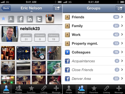
The Savi People iPhone app intends to simplify the task of keeping up with contacts from your iPhone and social networks, but it currently falls short of fulfilling its goal to provide a cohesive social communication iOS app. Plagued by confusing and circuitous navigation, limited functionality, and depressing visual presence, the Savi People iPhone app makes opening and closing multiple applications to find your contact’s information more appealing.
The Savi People iPhone app opens with a quick tutorial, and the description of functions and tools seem straightforward. You combine your Facebook, LinkedIn, and Twitter contacts with your address book. You can also select the information you want to copy like photos and birthdays. You authorize Facebook, LinkedIn, Twitter, and Instagram to upload to the Savi People iPhone app. The load time for the Savi People iPhone app is impressive. Then, you move to another tutorial after the upload.

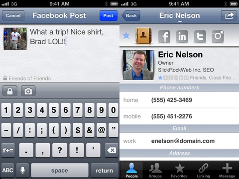
Normally, tutorials are good things. Each time I tried to combine contacts from different social networks; however, yet another pop-up tutorial attempted to explain what to do. But, it was confusing. If you want to combine a Facebook contact, you press an icon most commonly used to share an app’s photo or your score in a game to your existing social network. Each time you are trying to decide what information to combine into your Savi People iPhone app contacts group, you move from one screen to the next. And, it’s hard to get and keep your bearings. You use gesture controls on a menu bar at the bottom of the screen to move between different screens to access different feeds, but this menu bar disappears during the linking process. One of the menu icons is intended to help you call, text, email, or post to Facebook and Twitter from the Savi People iPhone app, but it doesn’t automatically link to the contact you may have on your screen. Some gesture controls to activate tools are in the top of the screen, and others are at the bottom. In one instance, icons are highlighted with a bold color, then the data and tools fade into the background. The varied, counter-intuitive graphic elements further increase confusion.

The Savi People iPhone app is trying to be a glorified contact list you customize. It is an excellent idea to have the opportunity to specifically select what profile photo you want to use for a friend or the primary phone number for you to reach a contact. The tools are just too muddied and frustrating to excite users and entice new downloads. If the developers placed as much attention on streamlining the Savi People iPhone app interface as it has placed on asking you to promote it with the bright “rate this app,” Facebook, and Twitter icons, then, perhaps, there would be something positive to shout about the Savi People iPhone app.
AppSafari Rating: /5
Leave Comment
About AppSafari
Popular App Review Categories
- Games
- Featured apps
- iPad apps
- Free apps
- Cydia apps
- App Lists
- Music
- Utilities
- Reference
- Social
- Chat
- Video
- Productivity
- Notes
- Fun
- GPS
- Files
- Augmented reality
- Shopping
- Education
- Finance
- Travel
- Food
- Sports
- News
- Weather
- Health
- Movies
- Photos
- VOIP
- Calendar
- Contacts
- Auto
- Dating
- Books
- Web apps
- All categories >>
Recent iPhone App Reviews
- Elevate – Brain Training May 28th, 14
- UpTo Calendar – Syncs with Google Calendar, iCloud, Outlook and more May 28th, 14
- Quip May 23rd, 14
- Marco Polo: Find Your Phone by Shouting MARCO! May 22nd, 14
- Ku – creative social network May 13th, 14
- Personal Zen May 9th, 14
- Fiasco! Free May 9th, 14
- Forza Football (formerly Live Score Addicts) Apr 29th, 14


