BuzzFeed review

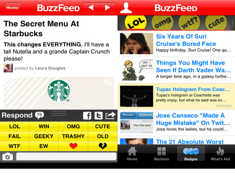
The BuzzFeed iPhone, iPod Touch, and iPad app delivers stories about politics, celebrities, sports, and lol cats with clarity and ease. It is free of visual clutter, simple to navigate, and contains nice sharing tools.
The visual clarity is accomplished by the choice to generate revenue for this free iOS universal download through promoted articles. The background of the articles in the lists is white, but promoted articles have a yellow background. The promoter is listed just under the headline. The promoted content is presented in a complementary tone and style to BuzzFeed, so it creates a much more seamless user experience that still makes BuzzFeed money.

The BuzzFeed iPhone app relies on standard, intuitive tools and navigation. There is a menu bar at the bottom of the screen to give you a chance to move through the content with one touch. You can access the home page with featured stories and a list of additional stories. The featured stories have a larger photo and take up a larger portion of the upper part of the screen. There are five featured stories that are accessed by horizontal finger swipes. For each article you select, the article and content fills the screen. Social engagement and sharing options remain at the bottom of the screen in a menu bar. You can comment or love; share to Facebook, Twitter, and email; open in safari; copy link; and bookmark the article. You can touch the bookmark icon at the bottom of the home screen to find your custom list. A touch on the back arrow at the top left hand corner of the article interface takes you back to the home screen.
If you want to check out content by categories, then you will want to touch the sections icon at the bottom of the home screen. The sections interface adds a horizontal menu bar at the top of the screen. With horizontal swipes, you can check out politics, then animals. A touch on each icon automatically changes the list of articles available.
The badges selection at the bottom of the home screen leads you to the truly fun BuzzFeed articles. You can sort by the following selections in a horizontal menu bar similar to the sections interface: lol, omg, wtf?, cute, geeky, ew, fail, win, pics, and video.

The What’s Hot icon allows you to sort the BuzzFeed iPhone app’s content by two categories. It shows you the top stories on BuzzFeed and on the web. You touch the appropriate sort icon at the top of the screen, and a new list appears.
The BuzzFeed iPhone, iPod Touch, and iPad app has solid sorting options and navigation tools for its vast amount of content, and it has unobtrusive ad placement.
AppSafari Rating: /5
One Comment to “BuzzFeed”
Leave Comment
About AppSafari
Popular App Review Categories
- Games
- Featured apps
- iPad apps
- Free apps
- Cydia apps
- App Lists
- Music
- Utilities
- Reference
- Social
- Chat
- Video
- Productivity
- Notes
- Fun
- GPS
- Files
- Augmented reality
- Shopping
- Education
- Finance
- Travel
- Food
- Sports
- News
- Weather
- Health
- Movies
- Photos
- VOIP
- Calendar
- Contacts
- Auto
- Dating
- Books
- Web apps
- All categories >>
Recent iPhone App Reviews
- Elevate – Brain Training May 28th, 14
- UpTo Calendar – Syncs with Google Calendar, iCloud, Outlook and more May 28th, 14
- Quip May 23rd, 14
- Marco Polo: Find Your Phone by Shouting MARCO! May 22nd, 14
- Ku – creative social network May 13th, 14
- Personal Zen May 9th, 14
- Fiasco! Free May 9th, 14
- Forza Football (formerly Live Score Addicts) Apr 29th, 14


I liked another app better one, Bubble struggle, which I found recently on App store.
Posted on February 7th, 2013 at 10:57 pm byiTunes Link:
https://itunes.apple.com/au/app/bubble-struggle-3/id586556024?mt=8
Notice: Only variables should be assigned by reference in /var/www/html/wp-content/plugins/subscribe-to-comments/subscribe-to-comments.php on line 591
Fulbert Lindsey